ShopDreamUp AI ArtDreamUp

Deviation Actions


Description
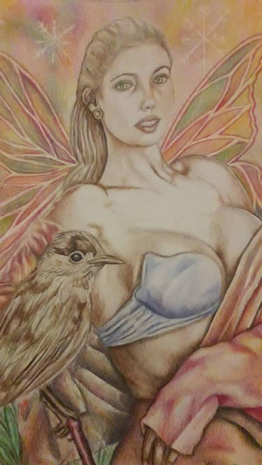
Done with pastels and pastel pencils. This was hard! The devil in those feather details and the bark. Eurgh
References used:
My own bark stock: charmed-ravenclaw.deviantart.c…
Girl and owl: www.deviantart.com/art/With-ow…
Constructive critiques more than welcome! I really want to know how this could be improved! Can critique things such as pastel technique, anatomy, hair bird details etc. The owl doesn't quite looks as good as the photo but oh well.
References used:
My own bark stock: charmed-ravenclaw.deviantart.c…
Girl and owl:
www.deviantart.com/art/With-ow…Constructive critiques more than welcome! I really want to know how this could be improved! Can critique things such as pastel technique, anatomy, hair bird details etc. The owl doesn't quite looks as good as the photo but oh well.
Image size
1462x2134px 2.64 MB
Make
Canon
Model
Canon EOS 1000D
Shutter Speed
1/30 second
Aperture
F/4.5
Focal Length
32 mm
ISO Speed
800
Date Taken
Jun 1, 2015, 1:22:54 PM
Sensor Size
8mm
© 2015 - 2024 Charlene-Art
Comments52
Join the community to add your comment. Already a deviant? Log In
<img class="avatar group" width="100" height="50" src="a.deviantart.net/avatars/p/r/p…" alt="
 " title="ProjectComment" />
 Hi there
First, let me bow in awe to your skills and capabilities.
Your use of colours and techniques in this picture are close to perfect. Using almost only brown in various shades, you worked out all the details and nuances impressively visible. The thing I like most is the owl, especially her feathers. The nuanced shading and the colours make it look almost real.
But the absolute highlight of the bird are her eyes. They are really perfect.
If I have to point something out that could need some work, then it would be her face/head. The face seems a bit flat. This is because the eyes are on a straight line instead of a slightly "curved" one due to the roundness of the skull. Also, the left side of the head, where the headband goes over her hairs, there is too much hair volume in this - it looks like either her head is bulged out on that side or her hair has really a lot of volume.
I would also really like to see this picture with a more detailed background - or with one that provides more contrast to the scenery. The way it is now, the viewer risks to oversee some details like the feather on the rear side of her head.
Compared to the feathers and the hair/skin, her jacket looks a bit unfinished, but then again, I did not notice before looking rather long at the picture. The attention is immediately drawn to the owl and the woman's face.
The fact that you used a reference made me give you only 4 stars in originality, but this is just to give the original artist some credit for having the idea. Overall, it's a great piece of art. Congratulation on that.
To improve it's realism would not to it any good, in my opinion. It is obvious that you put your own style into it which makes it really special and outstanding.